Floral Composition: the principles behind what you see
The Floral Composition class with Jaycee Gaspar was by far the most challenging class in my AECP journey. It wasn’t technique heavy, but it was full of information about the principles of design: color, value, line, shape, form, texture, and space, I was so inspired, I made not one, but THREE cards! I’m going to share them all, not with the usual detailed instructions, but a description of the design concept and how it is applied on each card.
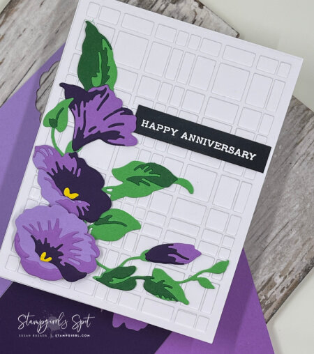
Let’s start with the purple card. This one primarily demonstrates color in a floral composition. Green and purple both share the color blue with yellow (green) and red (purple), which makes them secondary colors. The layered flowers and the white-on-white cover die adds a bit of texture to the design as well. But for now, I’m using this to demonstrate color. There is actually a ratio to maintain a visually pleasing color combination of 3 colors: 60-30-10. I’m going to push the ratio a little and say mine was 50-40-10. I was surprised that the 10% part really makes a difference! I learned that valuable lesson when I originally used a white strip for the greeting - it looked kinda blah. So blah, in fact, that I deleted the photos without saving some for reference (so you’re just going to have to trust me on this). I added a white embossed greeting on black paper - it made all the difference! It brought some balance to that side of the card - and it added a nice counterpoint to the bold colors.
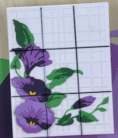
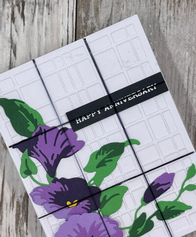
It’s also a demonstration of the “rule of thirds”, another important concept in design. place a 3x3 grid over your card. Focal items should be placed at the intersection of two lines. In this case, the greeting was placed at the intersection of two lines at the top right portion of the card.
Items used for this card: Gradient Cardstock in Shades of Purple and Green Fields, Morning Glory Craft-a-Flower die; Sentiment Strips; and Plaid Cover die B. Links to the items are below.
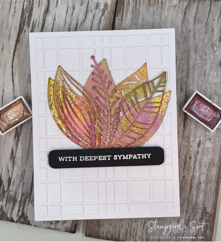
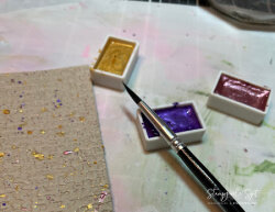
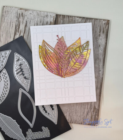
The morning glory card has a little bit of a lot of design principles, but I wanted to do one that was more focused on texture as an element. I finally used my metallic watercolor inks to color a large piece of watercolor paper with colors that have a feeling of Autumn. I cut out the leaves and sprigs from the inked paper then made the arrangement. I thought the background was a little “flat”, so I went back to the plaid cover die (it was already sitting on my desk) to add some background texture that wouldn’t overpower the arrangement of leaves. I made a cluster of leaves (7 - an odd number) and glued them to the center of the card. I went with a simple sentiment stamped and white embossed on black cardstock. The cover die adds some obvious texture, but it’s enhanced with the overlapping leaves and the layers of color on the leaves. And the good news is that I have leftover leaves to use on another project!
Used on this card: 14-pan Metallic Watercolors, 9x12 Watercolor paper, Leaf Mix die set, Sentiment Strips stamp, and die set. Items used are linked below.
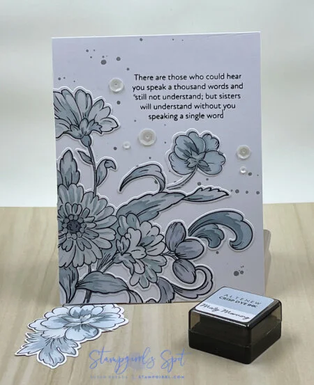
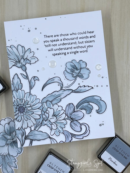
This blue card is an example of shape as a design concept. I stamped the flowers, then used the layering stencils to color them. Layering stencils are a quick and easy way to achieve a beautiful floral design. After coloring, I used the matching dies to die-cut the flowers and swirls, then placed them in a triangular shape on the card front. The greeting was stamped in the top right section of the card. I gave the background some interest by adding some silver splatters before adding the flowers, then added some white sequins - always in an odd number because that is more pleasing to the eye.
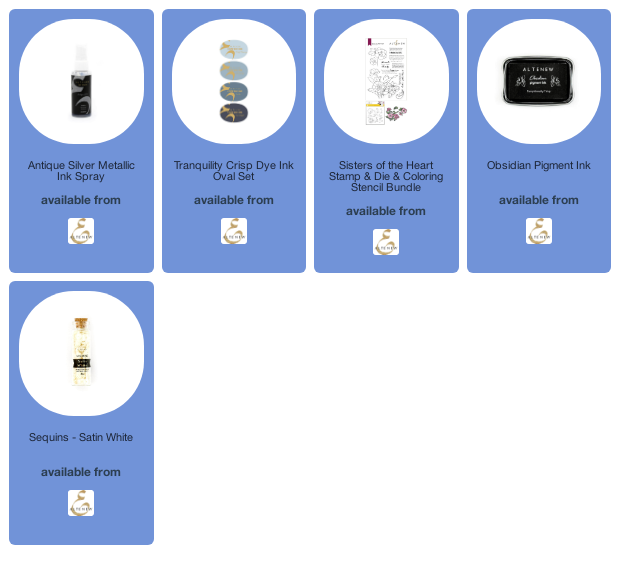
Items used for this card: Sisters of the Heart stamp, die and layering stencil set, Tranquility ink set, Silver Metallic ink spray, and Satin White sequins. See below for links to the items.
I could keep going and I did (you’ll see that card at another time)! The class taught me to be intentional about my card layout, not just glue things onto the card front. Maybe the mind does arrange things in a pleasing way unintentionally, but it’s a lot more rewarding to know what guidelines to follow to assure a pleasing layout. As I said in the beginning, these are principles I can use on any card I create, and lessons I will use when creating future cards.
Thanks for stopping by - I hope you thought this was interesting and gave you something to think about whenever you see any sort of design.
Take care, and be kind,
Sue
Disclaimer: The links below are affiliate links. If you use them, I’ll make a few dollars, but it won’t cost you any extra. A girl has to pay for all of this somehow!