
Watercolor Time!

I love the look of watercolor! The way the colors blend into one another and layer over one another can be truly magical. And when I hear about someone taking hours to paint a few flowers on a card, I laugh and think “why spend so much time on one thing?”. Then I did it! As I learned in the Watercolor 101 class, it really is a matter of time. This card took a few hours over a few evenings, and you don’t always hear me say this, but I am SO excited about how this turned out!! The trick is letting the paint dry in between layers! And not getting impatient - that’s the part I’m not so good at.
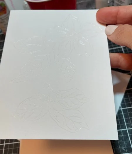
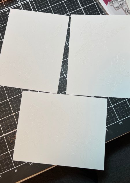
“Why don’t you try no-line watercoloring?” I thought, “That will be cool,” I thought. I tried to think of a good way to accomplish this, and I thought it would be cool to do white embossing on watercolor paper. If you look at the photos above, you’ll be able to see just how this backfired! Yep, I couldn’t see the flowers! Luckily, paper has two sides, so I can use the reverse side for another project!

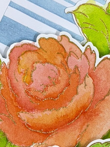
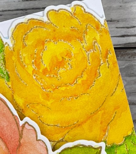
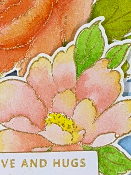
I reconsidered plan A, but I didn’t want to just do gold embossing. I went on a different path and instead, I stamped with Enchanted Gold ink, and used clear embossing powder. I got a slightly different effect than I would with the other method, and I was really happy with the results. I chose the Kind Reminders stamp set because the flowers had a lot of open areas and gave the illusion of shadows.
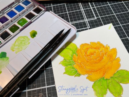
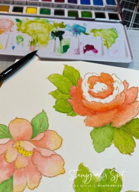
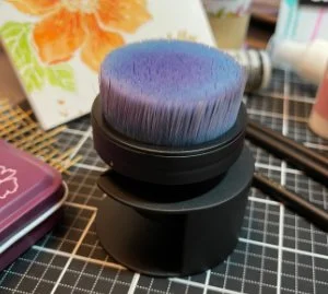
I used the 24-pan Watercolor set and I tried to keep the colors complementary, using shades of yellow, peach, and pink. I really took my time and built up the colors and the layers to give the illusion of shape and shadowing. It was the first time I’ve used the Altenew watercolor brushes and I LOVED them! I think the best part is the flat grips, they are much more comfortable than a regular round-handled brush, and the grips keep the brushes from rolling off your desk! I was really pleased with how the flowers turned out.
I used two different watercolor techniques: wet-on-wet and wet-on-dry. For the base layers on the flowers, I added a good amount of water, then dropped the base layer color. It was fun to watch the colors move along the water, then settle and stop - that’s wet.-on-wet Once dry, I went back with a wet brush and built up the color where I wanted the shadows to be - that’s wet-on-dry.
And I thought that was the difficult part! I struggled with this background too! that seems to be an ongoing theme!
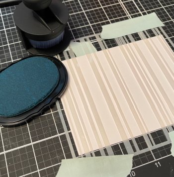
I made the background using the Beach Towel Stripes stencil. Because I like the way the strong stripes contrast against the rounded florals, It’s a difficult stencil to work with because we’re used to using a stencil in the portrait orientation, but because of the stripes, it’s easier to use in the landscape orientation, so you are working with the stripes and not against them. Although I do have dedicated blending brushes in a few colors, after use I always dampen a microfiber cloth and rub the brush on it. I don’t like putting away a damp brush, but I realized that putting the brush into the holder upside down, lets the brush dry before I put it away!
I liked the way the strong stripes contrasted against the rounded florals, so I decided to use it. I stamped a small greeting and placed the flowers around it. It looked a little empty, so I added some black Enamel Dots. They didn’t help. I was able to carefully remove the dots, but I still had a background I couldn’t use. I thought I’d repeat the layout with a stronger greeting, but that wasn’t it either.
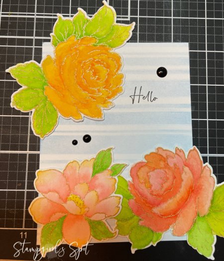
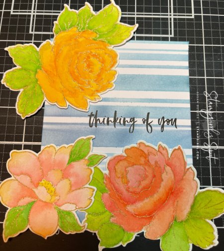
I realized that it was the layout I didn’t like, so I fussed around with it, and finally put all the flowers into the center - and there it was! It also hid the larger greeting, so I didn’t have to make yet another background - woot! I think I got a little giddy, so I decided to layer the front panel onto the card base a little wonky. I’ve never done this before, and now I’m wondering why not!
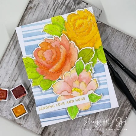
I’m really pleased with how this developed - and it was a process! Thanks for coming with me on this journey! I hope you enjoyed it!
Until next time,
Take care and be kind!
Hugs,
Sue